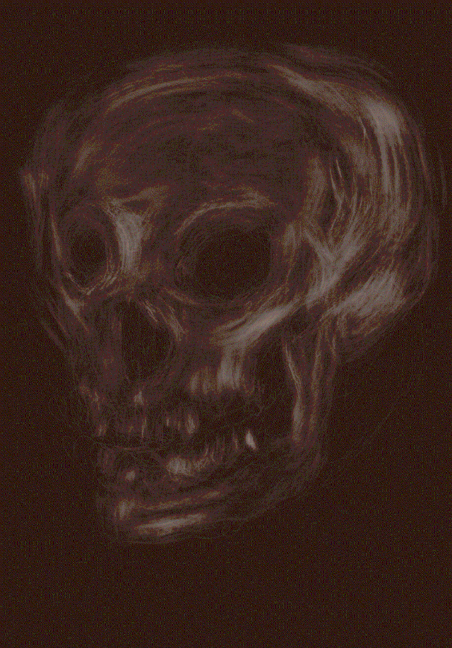
• Hello friend.

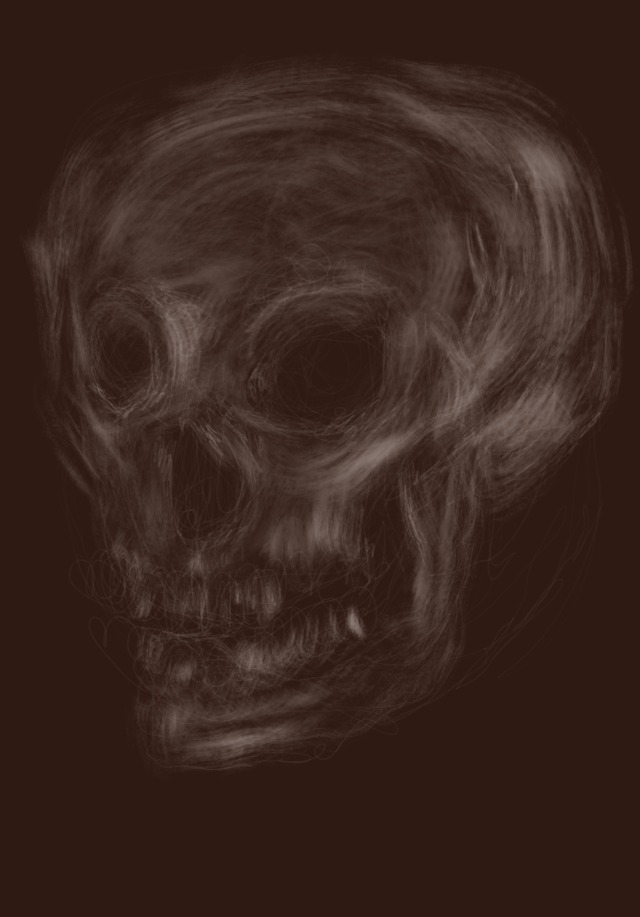
    Drew this skull yesterday as a cool down drawing in Procreate, and today I went back to it, to push it more towards to what I want.

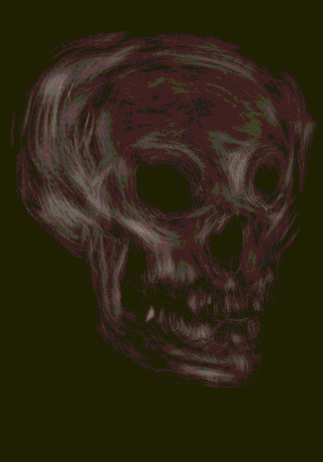
    I have color processed it in Affinity Designer, and then exported it from there as gifs using the websafe palette, using 16 colors as a personal goal.

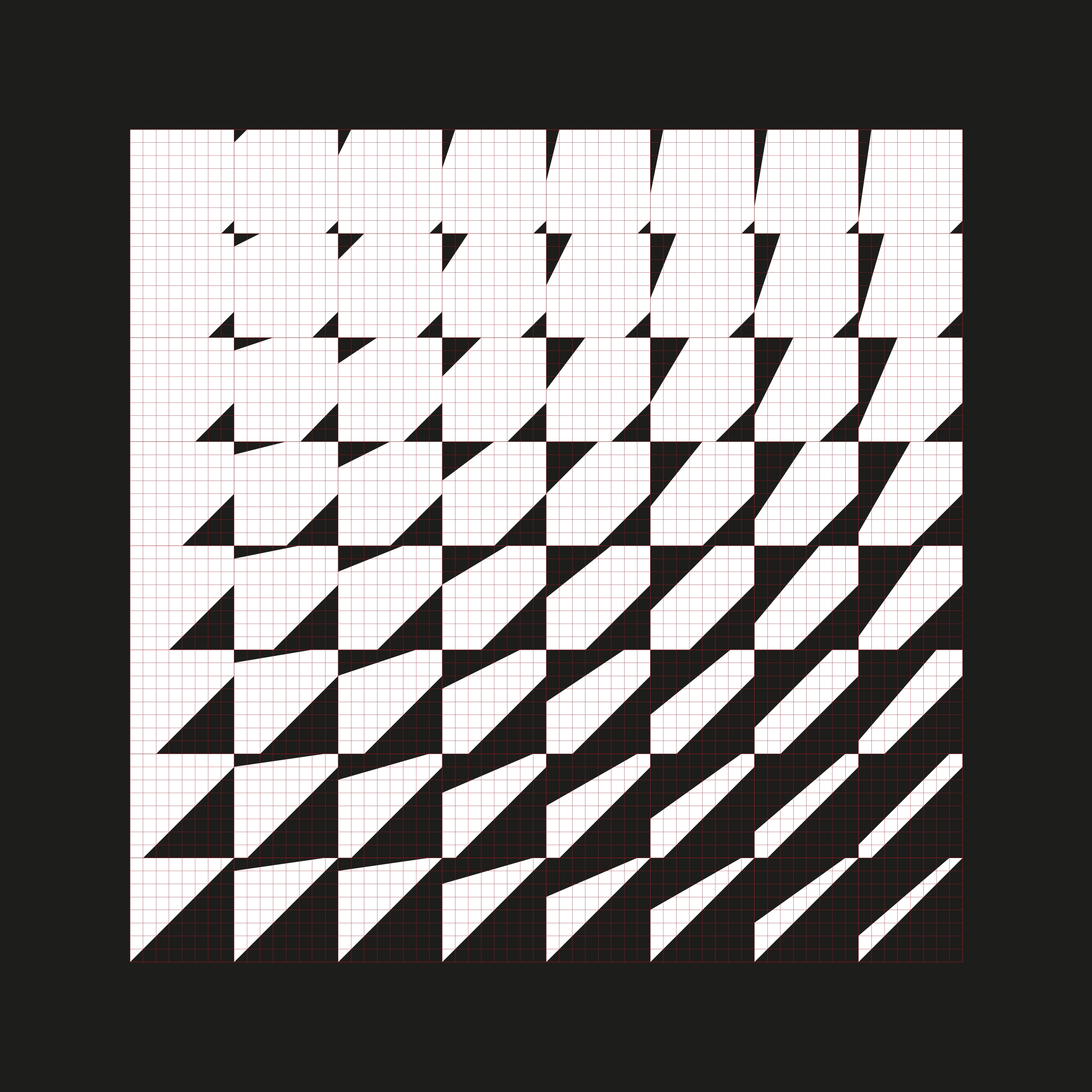
    After having spent a few weeks on researching, I enjoyed making these as a proof of what I am currently looking for in my design: a lower density in detail, overall.

    And I am looking for a pixelated look, like the ones above.

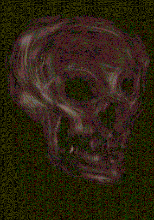
    Yesterday, I was annoyed with how limited Photoshop for iPads is in terms of how much control I have over image compression during export and filetypes to export to (even had a few more caustic words for that), but today I realized that I can make do with Affinity Designer. It is a long shot away from the control I am used to, while the latter is also really far away from, say, ImageMagick’s capabilities (which I will test more when having a command line in front of me again). I obviously use what I have, but you won’t see me glorifying a make-do much.

    I have a tendency to make drawings face to the left; that way, they seem to be facing me, like someone in front of me, if that makes sense to you. I flipped the skull for a couple of socials, added the first word that came to my mind, as sort of double-homage to both White Wolf RPGs and @plastiboo

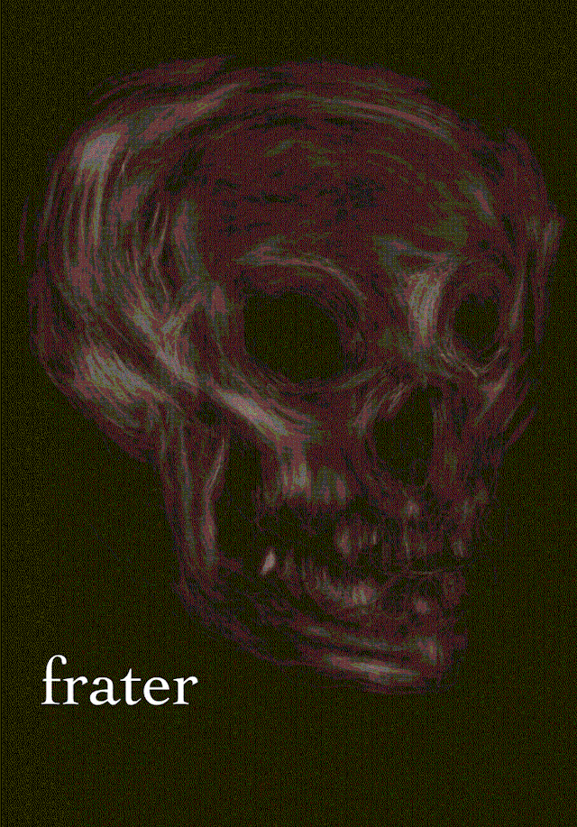
    Enjoy this image compression of which we see so very few. This looks like a lot of fun coming my way.

    Source: My after‑hours blog on Tumblr Code & Canvas

  • Might write something about something on my after-hours blog on tumblr later #asca
    I think finding so few literature about the point/the dot as a design element must be noteworthy.

    Will link to the post here and elsewhere, bring a cool beverage along if you hyperlink thru https://x.com/MarioBreskic/status/1856377388386353313

    Source: My Twitter Account Mario Breskic

  • Currently working on a rough-smooth contrast after an illustration I saw in Ittenʼs Design and Form. I could do the illustration in less than an 1h in Painter using a 🔺brush, because copying is never a skill issue, but I want to do it in Procreate “the long way” #asca

    Source: My Twitter Account Mario Breskic

  • Tablet might be an alternative to a sketchbook?
    Still will add a real sketchbook from my workshop next week.

    Play to strengths of either medium seems plausible #asca

    Source: My Twitter Account Mario Breskic

  • Die Zeichnung von gestern Abend habe ich nochmal gewissen Prozessen unterworfen. Besten Dank an @affinitybyserif ohne welches die von mir gewünschte Farbkompression auf einem Tablet sonst nicht möglich wäre.
    Schade, dass das schlicht mit Photoshop (das Grafikdesign-Programm schlechthin) in seiner mobilen Variante nicht Teil des Programmes ist.
    Ich brauche einfach Schieberegler und Menüs lol #gläsernewerkstatt #gif #webcolors #websafecolors

    Irgendwo zwischen drei oder vier verschiedenen Künstlern findet sich auch ein Raum für diese Arbeit.

    Source: My Instagram account Mario Breskic

  • I am not saying you should pilfer, pillage, and hoard tools (do not ever become an archivist permanently), but I am saying that you need at least one tool which does things differently. #asca

    Source: My Twitter Account Mario Breskic

  • Hello friend.

    My post–degree studies have brought me back to the foundation of design, namely the dot, the line, and some strange mistranslation of the German noun “Form” into either form or shape, which, depending on the author, could be either.


    I have actually moved backwards from studying computational design, using algorithms to create shapes, to making digital lines using a drawing tablet, and have now moved on to what I would call the machine code of design, the bits and bytes of it all: the dot, the point, the directionless and dimensionless shape. And the literature I have with me right now, seems appropriately thin, like you would expect from a good mystery.

    ok, I got this, I understand this, let me do something more interesting

    This has happened for the following reason: it is easy to move beyond this stage, I think. You can just say “ok, I got this, I understand this, let me do something more interesting”, and off you go. And I did. Passing the grade, moving on, being done, like actually done, as in “done with it”.


    But I knew I was hurrying things along. I knew I was actually doing harm to my skills profoundly: logical understanding that is, grasping what is said, doesn’t equal comprehending intuitively. And I want to comprehend, I want to have a solid foundation in my craftsmanship. You and me both know of that sweet spot where work becomes almost like play.

    I think this is a good enough proof of life as any. Be so good they can’t ignore you is not just the title of a book I’m reading right now. I think it is an opportunity to do exactly that. And in my case, that all comes back to working on understanding the

    .

    So, join in, why don’t you?

    Source: My after‑hours blog on Tumblr Code & Canvas

  • “If we perceive the juxtaposition and depth in our environment not just as a series of images in our minds, but as a three-dimensional structure (which in turn defines our thinking), then and only then will we escape the visual chaos of our surroundings and can turn to planning.”

    Ulf Jonak, Grundlagen der Gestaltung (in English: Design Foundations)

    Source: My after‑hours blog on Tumblr Code & Canvas

  • Light travels & views from a bus #cameraroll

    Source: My Instagram account Mario Breskic

  • Aus einer Reihe an Experimenten, inspiriert von dem Buch „Nea Machina“: der Workflow ist bizarr, und ist­‑zumindest auf dem Tablet‑ohne Serifs Affinity Designer schlicht nicht möglich: moderne Software kann bedeuten, dass man alte Prozesse nicht mehr ausführen kann, hier an einem GIF meiner Katze Miez nachvollzogen.

    #gif #dithering #pixelcats

    Source: My Instagram account Mario Breskic