Es gibt zwei Arten von Schrift, die das Lesen erleichtern: die eine erleichtert das Durchlesen, die andere das Verstehen.
https://t.co/VRrekYaCRy #asca
Quelle: Twitter
Meine Social‑Media‑Beiträge – offen und ohne Anmeldung
Es gibt zwei Arten von Schrift, die das Lesen erleichtern: die eine erleichtert das Durchlesen, die andere das Verstehen.
https://t.co/VRrekYaCRy #asca
Quelle: Twitter
Armin Hofmanns Beobachtungen sind sowohl für Künstler, als auch für Wissenschaftler bemerkenswert.
https://t.co/gachIe0sre #asca
Quelle: Twitter
Ich habe eine Schwesterliste zur Liste von Generativen Künstlern auf Twitter hier auf Bluesky gestartet:
die Liste dort: https://x.com/i/lists/2011076175351644223
die Liste hier: https://bsky.app/profile/did:plc:dt4jjxf6i32tysbewxiiuxrb/lists/3mcfstk67u22m
#asca
Quelle: Bluesky
Wenn etwas meinen Kopf braucht, um zu existieren, soll’s halt selber klarkommen – sonst ist es für mich schlicht nicht real.
https://t.co/KnMTVXcN0y #asca
Quelle: Twitter
Ich blicke auf eine Woche zurück, in der ich meine Ruhe im „Auge des Sturms“ fand. Zwischen Notizen, gutem Essen, Büchern, und noch mehr Notizen, fand ich ein Leben wieder, das es lohnt, gelebt zu werden.
Wenn man dazu bereit ist, seine Lebensgeister selbst zu wecken.
Ebenfalls überarbeite ich meine Social-Media-Filter so, dass ich Leuten, die sich selbst nicht mehr im Griff haben, gar nicht erst folge, sodass meine Wortlistenfilter für echte Dinge reserviert bleiben.
Quelle: Mastodon
Gestern Nacht von FL Studio und vor allem von den UIs der Plugins und VSTs geträumt. Ich glaube, dass das ein Zeichen für Grafikdesign 2026 ist. Ist ja mein Traum 😉
https://t.co/AXT2gMrnma #asca
Quelle: Twitter
Zwischenstand in #huginn: nachdem wir uns auf ein Schema geeinigt haben, funktioniert unser Prototyp für den hoffentlich in naher Zukunft prosozialeren @medienfeed schonmal ganz brauchbar.
Wert in Abhängigkeit der URL für Authors im RSS-Output setzen sieht dann so aus:
#asca https://t.co/pt1I89H8HS
Quelle: Twitter
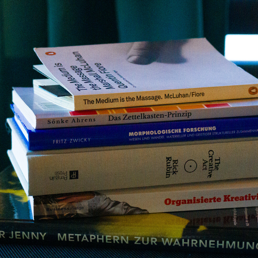
Hier habe ich mal ein total umständlich geschossenes Foto meines Lesestapels für die Woche gebaut, mit Lightroom, ’nem ColorChecker, und dann mit meinem geliebten Midi‑Controller die Farben nochmal so angepasst, dass das Blau schön „poppt“. Dann das TIFF noch durch #ImageMagick gejagt, und hier ist der Kasten.
Insgesamt entdecke ich den Nutzen von handgeschriebenem und handgemachtem wieder, lese mehr Bücher aus Papier (vor allem Fantasy), und habe, nachdem ich mich von GoodNotes und auch Notability verabschiedet hab’, die handschriftliche Notiz wieder ausgepackt. Meine Sauklaue als Grafikdesigner ist ja nur für mich, hat auch was von Kryptografie, lol.
Und es wäre schon geil, die ganzen Lesematerialien nicht nur durchzulesen, sondern mit ihnen zu arbeiten, als Grafikdesigner läuft man sonst Gefahr, dass man nur noch reagiert und irgendwann schreit man halt den Fernseher an, aber ich schweife ab.
Lest mehr Bücher und macht euch eure Notizen, Kinners!
Quelle: Instagram
Jeder erinnert sich mit Begeisterung an blitzschnelles Photoshop auf brandneuer Hardware. Behaltet diese Version eurer Software. #asca
Quelle: Threads