Does the goblin like this?
-
-
January 11, 2025 at 07:22PM
Starting out as an artist or designer in 2025 is beneficial to your craft, because you donʼt need to unlearn orthodoxy about ai tools in your work.
Make your dreams become manifest. Become an absolut crack at using all the tools you can teach yourself! #ascaSource: My Twitter Account Mario Breskic
-
January 11, 2025 at 11:54AM
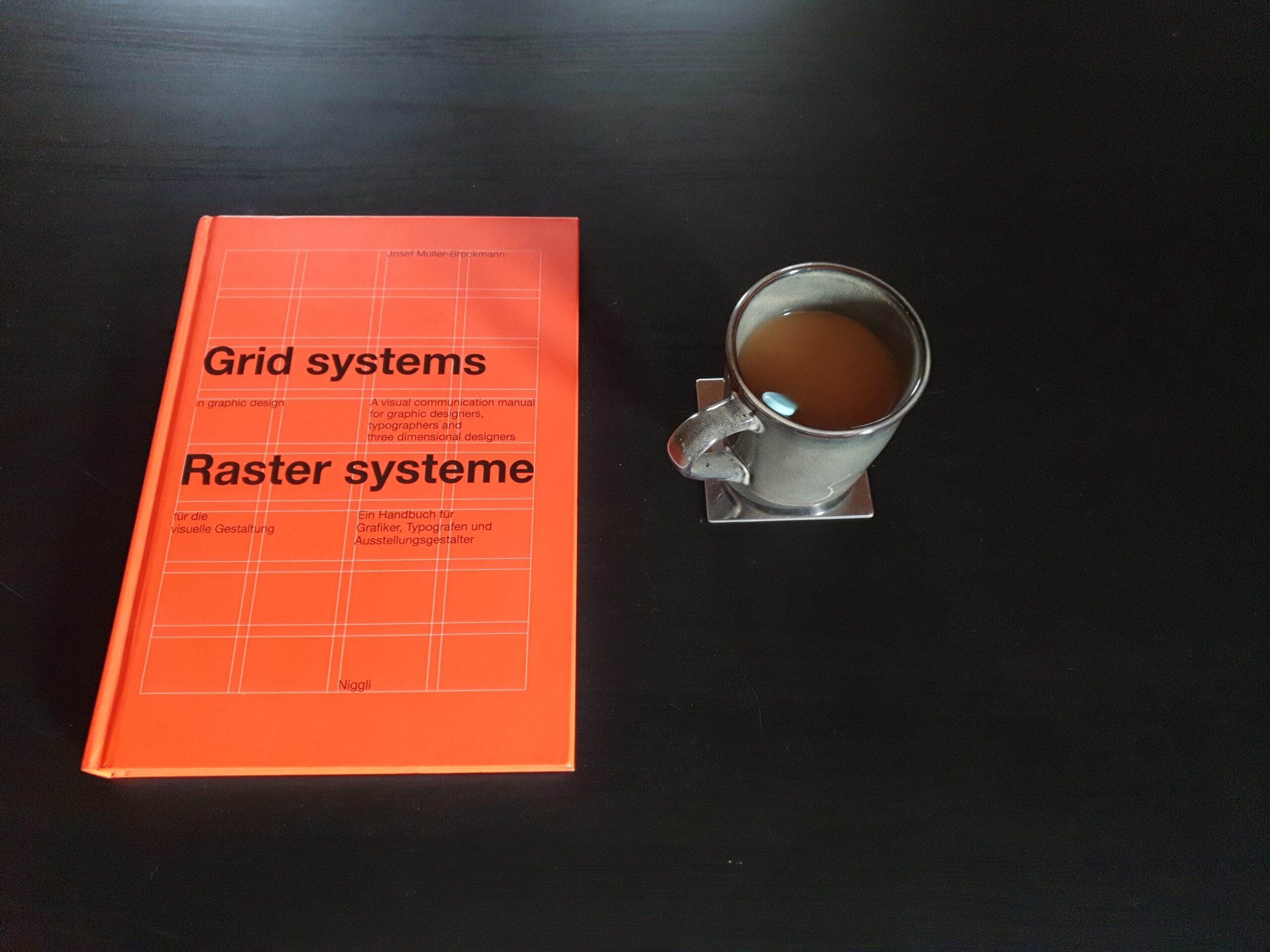
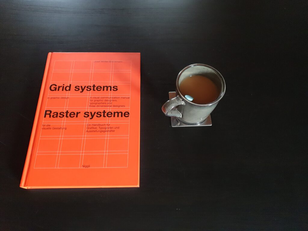 Freue mich schon seit Dienstag darauf, „Raster Systeme“ aus dem Verlag @niggli_verlag besser zu verstehen. Es ist eines der Bücher, die die Grundlage für Gestaltung im deutschsprachigen Raum darstellen (mir fällt auf die Schnelle auch kein anderes ein), weswegen es vielliecht eher mal in Vergessenheit gerät: es nur im Regal stehen zu haben reicht aber einfach nicht, das Wissen diffundiert aber einfach nicht osmotisch, auch nicht wenn man sich das Buch unter das Kopfkissen legt.
Ich habs mit Regal zumindest probiert und außer einem schlechten Gewissen und Selbstzweifeln nichts weiteres an Einsicht erhalten. Habt ihrs denn schon gelesen? Wie fandet ihrs? Hat die Kopfkissenmethode funktioniert?
Und was steht bei euch noch so nach dem Haushalt zum Lesen auf dem Plan? Darf auch gerne kein Sachbuch sein (habe seit neuestem die Brontës im Regal, da freue ich mich auch drauf).
Also auf an den Kaffeetisch und das Ding lesen und verstehen 😎☕ #grafikdesignbücher #grafikdesignbuch #graphicdesignbooks #graphicdesignbook #asca #lebenslangeslernenSource: My Instagram account Mario Breskic
-
January 07, 2025 at 01:19AM
consider simply downloading and storing my bookmarks. Nothing fancy. I will spin down wallabag in the next few days, and remove it as well, for the sake of not expending anymore psychic energy on this whole affair.
Source: My Mastodon Instance Mario Breskic
-
January 07, 2025 at 01:16AM
I’ve spun it down again, and removed it altogether. I think that there is a better solution to all of this. I think that the best solution is to simply not selfhost as best as I can, because at the end of the day, it is me who has to look after it all.
And by now, I am looking back at a few hours of taking care of software I just realized I do not need.
For the sake of completeness, I will stick to using Firefox’s internal bookmark manager, and should I need anything beyond that, I will→Source: My Mastodon Instance Mario Breskic
-
January 05, 2025 at 06:45PM
I wrote about how I see professionalism, inspired by Csíkszentmihályi and Newport, on my sideblog, Mario Breskic.
I‘m going to leave the question about how I will use social media in the foreseeable future open. https://codeandcanvas.tumblr.com/post/771855607869456384/log-003-the-heart-of-the-matter
Impostor syndrome is just a poser’s guilty conscience, you know?Source: My Mastodon Instance Mario Breskic
-
January 5, 2025 at 06:41PM
Writing about this is difficult; I can’t pretend it isn’t. Studying Csíkszentmihályi’s book “Creativity” alongside Newport’s “Deep Work” has sort of answered a question I’ve had since at least 2019: Why aren’t there more graphic design students on Tumblr? And now I realize that this question is just a version of the more obvious question: Why aren’t professional graphic designers more active on social media? And I think I understand now why. I am reading these two books to reconnect with the deep satisfaction I felt working on my bachelor’s thesis, which was difficult for two reasons: it was heavily theoretical, and there was very little time left to write the thesis. And somewhere along the way, I started to realize something about social media—two answers to my questions. Professionals simply don’t use it that much to talk shop. Unless what they talk about sells a product. Social media is marketing. That is easy enough for me to accept. The second answer is more difficult for me to accept: professional graphic designers are not more active on social media because neither their (deep) work nor their study is a good fit for social media. By and large, they are simply too busy doing the actual work to be interested in writing about it on social media, worst of all, maybe even on some sort of schedule. Professionals, in short, are either out of the office or available for business. And I think that is also why most professionals are hard to reach and come by, why so many of them become seemingly absent from media: they are deeply involved in their work. And I feel that this is a fair price to pay for professionalism, for flow states, for deep work, for becoming so good they can’t ignore you. I, for one, still struggle with doing something without then telling someone about it, be that a person or on social media, and this series of posts I’ve been doing lately illustrates this issue quite well. Of course, I can tell myself that I want someone to be inspired by what I write here, but that is not really the truth. The truth is that I have accepted the social programming of social media to such a degree that I’ve started finding it difficult to simply do what I do and do what I want to do for the sake of doing it. I am a temporarily inconvenienced influencer, just 99,930 followers short of 100k, on average. And by knowing that about myself and telling you about it, I am forcing myself to accept the deal to turn pro, instead of turning myself into an influencer whose racket is graphic design or into a person who can’t focus on work. I don’t know where that leaves my social media accounts. And for right now, it doesn’t need to be addressed or solved. If you ask me, go out and find these two books and read them. That is all I can say right now. I don’t even know if this post makes sense. I’ll have someone look it over without touching its Flesch-Kincaid score and then read through it a few more times. How can you write about something when the central point is that publishing it is an issue?
Impostor syndrome is just a poser’s guilty conscience, you know?
Source: My after‑hours blog on Tumblr Code & Canvas
-
January 04, 2025 at 08:52PM
#linkwarden does its thing and I’ll let it work. #afk
Source: My Mastodon Instance Mario Breskic
-
January 04, 2025 at 08:44PM
 Glitch‑Collabo mit @ariane.konzepterin.
Original von @wahlhuetter #glitchSource: My Instagram account Mario Breskic
-
January 04, 2025 at 08:07PM
If you understand the Internet, explain it to me. Because I don’t. #asca
Source: My Twitter Account Mario Breskic