There is a need beneath the need to communicate. I have it. Maybe you have it, too. Maybe, like I was before, your mind has been clogged up by projects never finished but also not abandoned.
Maybe reading server logs when you are bored is a thing you do, too.
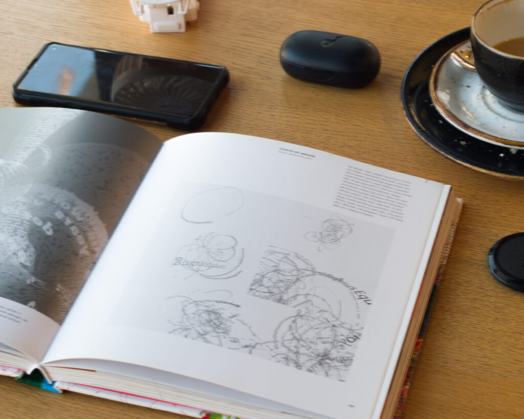
I realized in ’23 how the thoughts I have are not who I am: they are habits, like how the grooves in licorice pizza interact with the needle. Ever caught yourself in what can be called Verhalten, that is, behavior? Something on repeat, the needle’s arm going back to the start of the record.
What I realized was, that people are on loops when they check out of communication and interaction. Out of life. You can watch it happening to you best and most easily: which words do you repeat every day? Is there a trigger for them? Which thoughts, whole stories of them come to you every day?
Thoughts are habits. They are habitual behavior of our minds, big fat neuronal firing patterns wasting your energy and time on something which is just your brain idling, neither creating problems, nor solving them. Just the needle in the groove, just the groove pushing the needle, in a loop.
And when it ends, along with all of your own thoughts about this firing pattern, maybe you just realized that even the thoughts about the pattern, are all part of the pattern your brain fires on its loops.
You can do what I did: become bored by the repeat. Demand better thoughts, new one ones, if better is too much to ask for.
And start a conversation about how you behave during the day, every day, is not who you are. Just a pattern of habits our brains go through when idling.
I used to be depressed, you see? Now, I don’t care anymore about that. I want to be something else now. And then the new thoughts came.
I don’t behave anymore. I just do. This is not about philosophy, because philosophy is over. No labels, no genre, either. This is neither fiction, nor its opposite, nor a third thing.
I can just sit here, and write this down, and you will read it. Something might happen then. Doesn’t have to.
I don’t miss people. Instead, it became a habit to think of them.
I don’t work on my past experiences. I just habitually think of and talk about my past.
If you are bored of this happening on repeat, maybe after a decade of it, maybe more, then it is time to do something more interesting with that licorice pizza. What happens when you don’t let it play out anymore?
And just so that we are clear on this, choom: all I want is to be myself, not my habits. You wanna be yourself, too?
Stop believing anything there can be said about you. Especially your own thoughts about yourself, about others. Exist in a context out of context with others, is what I am sayin’.
Source: My after‑hours blog on Tumblr Code & Canvas
